Title/Font Choices and Justifications
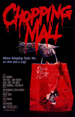
This title is for the film Chopping Mall.
Reasons why this font is good:
This font is good because it is bold and it stands out to attract the audience. It is also good because it relates to what it is about because of the blood dripping. The font is red which also relates to the film because of blood. The font is big which makes it stand out more to the audience.
Reasons why this font is bad:
The font is bad because it makes it harder to read due to the blood drips. It is also bad because the title font looks as if the film is supposed to be a comedy horror. It doesn't look serious.
Would we use this for our film?
No because the font makes the film look like a horror comedy so people would find the film funny rather than scary. The font suggests that the film isn't a serious horror. Using a simple text stands out more with a simple effect rather than a title like this one so that's what we will use.
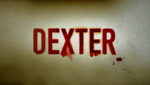
The Font is for the TV series Dexter.
Reasons why this font is good:
This title is good because it is simple but stands out. the simple effect of the blood splatter makes the font look good. the font isn't fancy which would make it less scary. the font is also good because it is red which relates to blood.
Reasons why the font is bad: In some cases the font doesn't stand out as much as e.g. the Chopping Mall font because it is a lot bigger and bolder. People might find the font looks boring because it is a simple font.
Would we use this for our film: Yes we would use this type of font for our film title because it is simple but effective because of the blood splatters. It looks better than fonts that are more detailed because it makes the film look more serious and scary. We could use the effect because it relates to our opening sequence which contains torture.
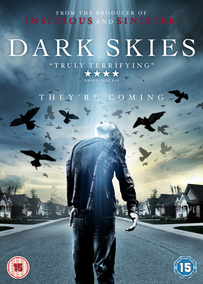
This title is for the film Dark Skies (2013).
Reasons why it is good:
The title is good because it is quite bold and stands out on the page. The title is good because the font is quite simple which makes the film look more serious and scary. i think that the text is the right size because it creates space for the picture underneath.
Reasons why the title is bad:
The title is bad because it looks less scary because the title is white rather than horror related e.g. red. I think that the title is bad because the colour of the text makes it harder to see on the background. Due to the font being simple it could show that the audience might find the film boring.
Would we use this type of title/font:
Yes we would because it is a simple title and it is the right size for the page.we would use this title for our opening sequence because it is quite sharp which relates to our sub genre that is torture like a knife...
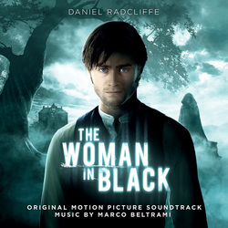
This title is for the film Woman in Black (2012).
Reasons why it is good:
The title is good because there is a contrast of colours blue on black. the ext fades into the character. The colours and image have a paranormal look which is good because it relates to the film and shows the audience what the film is about.
Reasons why the title is bad:
the colours could be a bit darker to make it look more scary. the colour of the title might be hard to see as it is the same colour as the background.
Would we use this title for our opening title sequence:
No we wouldn't use this title for our opening title sequence because it doesn't relate to what our opening sequence is about which is torture. this title is more for paranormal.
